How to make a plotmatrix with custom Plots in the diagonal - Rmarkdown
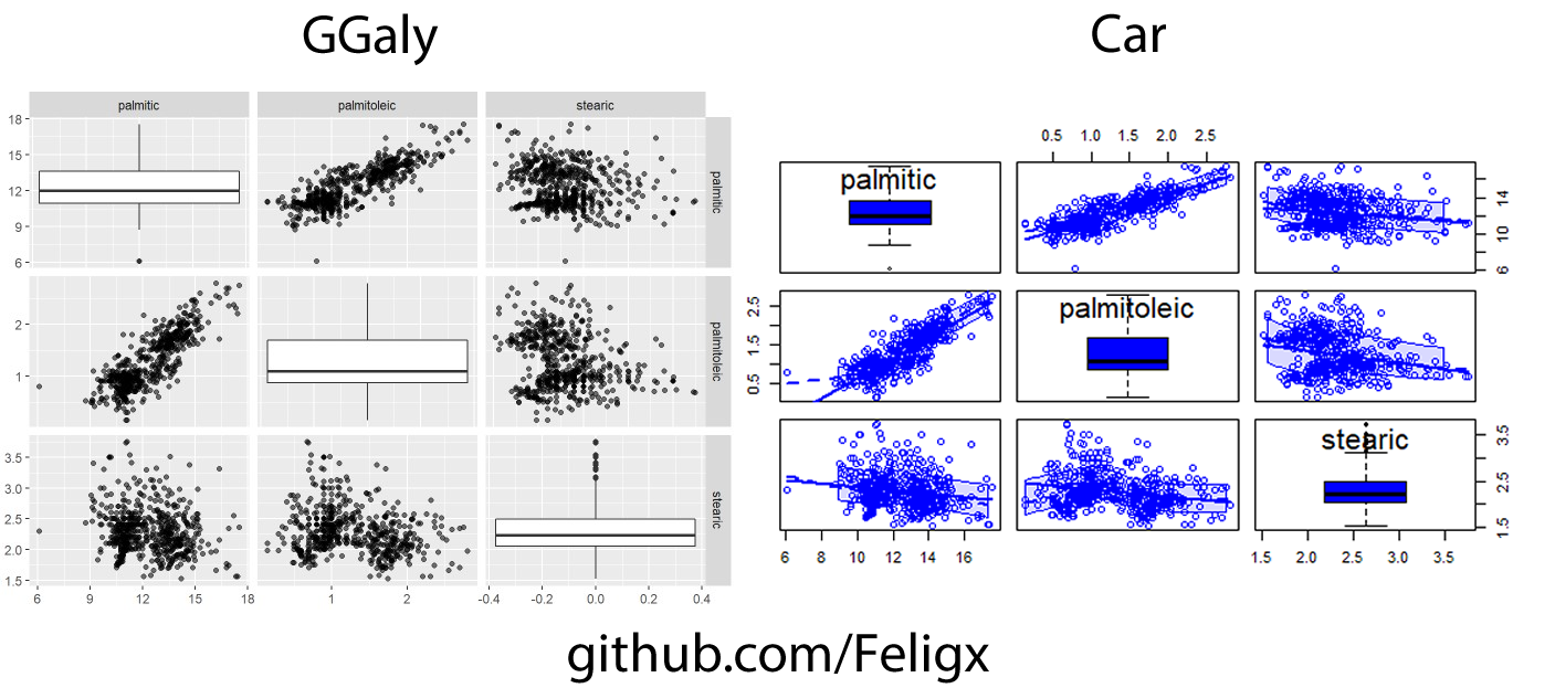
Hi and welcome to my first guide on Rmarkdown, here I will show you how to use either car or GGally libraries to do the job and get a plot matrix with a boxplot on the diagonal of the matrix.
First of all you need to get one of those libraries, what you may want could depend of the result each library gives, so here are the final thing you will get with these libraries:

Now you have decided what library to use, check if you already have it or if not, install it.
To do this we can use the library() function to check if we have it installed.
#to check if you have car installed
library("car")

#to check if you have GGally installed
library("GGally")
If you dont have the library of your preference, then install it by using install.packages() like this:
install.packages("car")
install.packages("GGally")
Now that we have the tools to make the plots, lets get started.
First, we choose a dataset or dataframe to work with, here for example I will use olive dataset from the package “dslabs”, but you can use the dataset you wish. Then, we can start building the plot, so we got the two cases:
-
Using car library: We can produce a plot like the one that we want using only one line! Just choose some columns or all colums to be plotted in the graph an choose a type of plot to be on the diagonal, here for the guide I use boxplot, but you can easily change that to any of “density”, “boxplot”, “histogram”, “oned”, “qqplot” or “none” to get an empty diagonal.
library(dslabs)
require(car)
scatterplotMatrix(~ +., data = olive[3:5], diagonal=list(method ="boxplot"))
And there you go! Right now and if all is doing well you should have a plot like the shown at the begining of the guide.
-
Using GGally library: If we decide to work with GGally, we have the oportunity to set up the matrix as we want, we can decide of some default type of plots to be un the upper, lower or even the diagonal part of the matrix. Or, as we are going to do, change the plots to any plot made with ggplot2 and in this example (again) we are going to use a boxplot.
 #Makes the basic graph with empty diagonal using the 3 to 5 cols of the dataset, and a scatterplot for the rest of the graph
graph <- ggpairs(olive, columns = 3:5, aes(alpha = 0.5), upper = list(continuous = "points", combo="box_no_facet"), diag = list(continuous="blankDiag"))

 #Generate the 3 boxplots to fill the diagonal adjusting the x-axis to the center and defining the variable to use on the y-axis
box1 <- ggplot(olive, aes(x=0, y=palmitic))
box2 <- ggplot(olive, aes(x=0, y=palmitoleic))
box3 <- ggplot(olive, aes(x=0, y=stearic))

 #Add the boxplots to the coords in the matrix at the diagonal
graph[1,1] <- box1 + geom_boxplot()
graph[2,2] <- box2 + geom_boxplot()
graph[3,3] <- box3 + geom_boxplot()

#Finally render the plot matrix
graph
And that’s it, if you make all things good, by now you should have the plot that we wanted to obtain and was shown at the begining.
I hope you find useful this little guide, since i couldn’t find any clear guide on how to do this i wanted to make one myself if I managed to get it done… And here we are!
If you liked the guide, you could see the rest of my repos on GitHub, and also can support me and my projects any time using my Ko-Fi

For more use cases and see other options on those libraries see: GGally - car